

Trend lines
Compare periods on one shared axis with a dashed baseline and a clear end-point marker.
Best for change over timeLoading
Connect your data and watch revenue, retention and acquisition update live. Spot what moved, and why, in seconds.
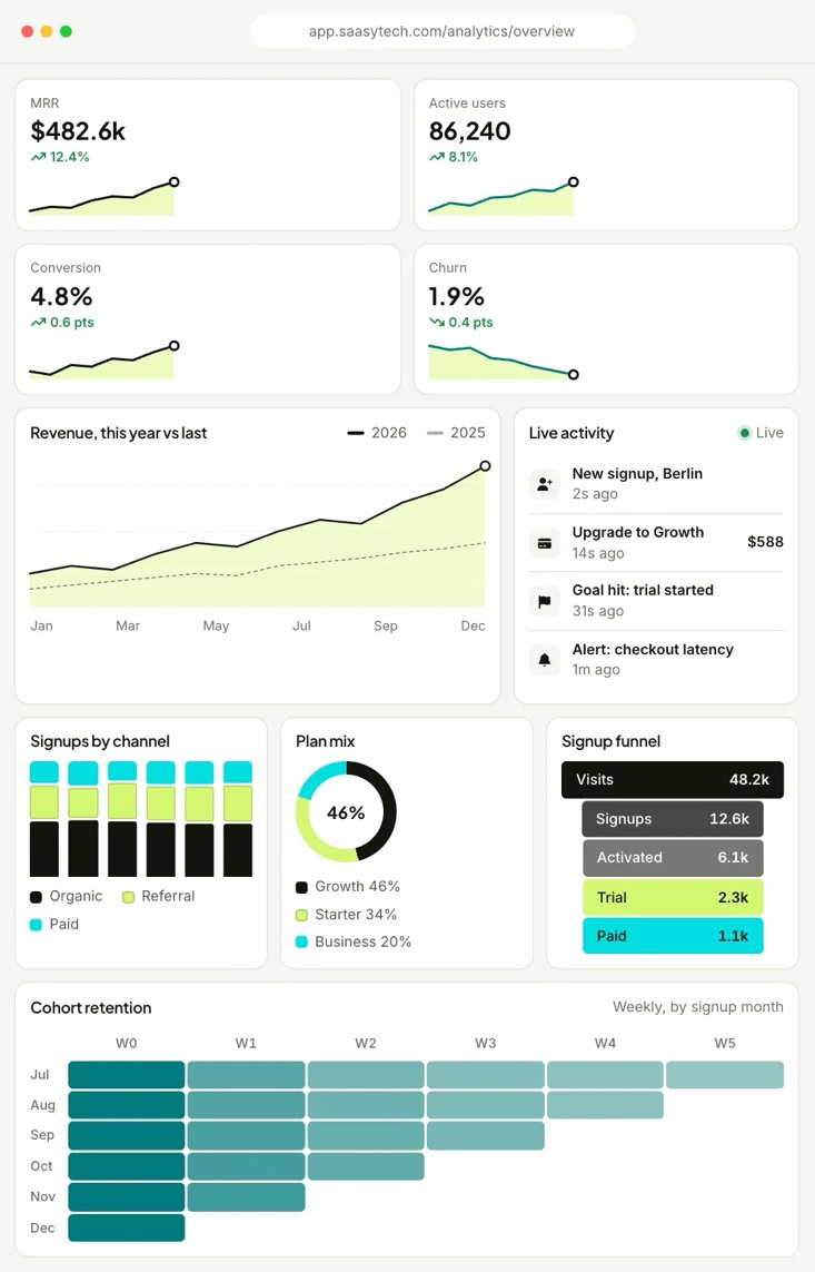
Start from a ready-made report, then slice by plan, region or campaign without writing a single query.
21% vs previous quarter
7 pts since July
Users who finish onboarding in day one stay twice as long.
Biggest drop: signup to activation. Add an onboarding checklist to close the gap.
Six chart types, one consistent style. Clear labels, restrained colour and accessible descriptions on every chart.
Compare periods on one shared axis with a dashed baseline and a clear end-point marker.
Best for change over timeRank categories or split totals into parts, with spacing that keeps every segment readable.
Best for comparing categoriesShow how a handful of parts add up to a whole, with the headline share in the centre.
Best for share of totalFollow people step by step and see exactly where the biggest drop-off happens.
Best for conversion pathsTint cells by value to spot habits, decay and the cohorts that stick around.
Best for retention patternsPut a trend next to every headline number so context is never one click away.
Best for dashboards and tilesEverything you need to collect, model and share insight, built into one analytics workspace.
Events land in dashboards within seconds, so launches and incidents never wait for a nightly refresh.
Type a question like “signups by region last week” and get a chart you can pin, share or schedule.
Group customers by behaviour, plan or source and compare how each group retains and expands.
Get a message in Slack or email the moment a metric moves outside its normal range.
Send a link, embed a board or schedule a PDF. Everyone sees the same, always-current numbers.
Row-level access, audit logs and SSO keep sensitive data in the right hands.
Read-only connectors for databases, warehouses and ad platforms. Most take under five minutes to set up.
Revenue analysed on SaaSyTech this year, across 12,500 teams and 190 countries.
Median revenue growth
Reporting time saved weekly
Dashboard uptime
“Our Monday revenue review used to need three spreadsheets. Now it is one live board everybody trusts.”
 Sofia MarinCOO, Northwind Logistics
“The funnel view showed us exactly where people stalled. One onboarding fix lifted conversion within a month.”
 Marcus TanHead of Growth, Voltra
“Cohort heat grids made retention obvious to non-analysts. Product and finance finally argue about the same data.”
 Hannah WeberCFO, Pulsewave
Every plan includes unlimited viewers. Start free for 14 days and change plans whenever you like.
For small teams building their first dashboards.
For growth teams that live in their data.
For organisations that need governance at volume.
Connect your first source in minutes and get a live dashboard today.